10 Reasons Your Shopify Store Gets Traffic but Not Sales
Getting people to visit your Shopify store is difficult.
Getting them to buy is a completely different challenge.
You may be running Google Ads, posting consistently on social media, working with influencers, investing in SEO or generating traffic from TikTok and still open Shopify Analytics at the end of the day to see plenty of sessions but disappointingly few orders.
This situation can make it tempting to conclude that you simply need more traffic.
But that isn’t always the answer.
If 1,000 people enter a physical store and almost nobody buys anything, bringing another 1,000 people through the door doesn’t necessarily solve the underlying problem.
Something may be preventing those visitors from becoming customers.
Your Shopify store has to do more than attract attention. It needs to create confidence, communicate value, answer objections and make purchasing as frictionless as possible.
Below are 10 areas worth investigating.
1. You're Attracting the Wrong Traffic
Not all website visitors have the same value. Suppose
Store A receives 10,000 monthly visitors from viral social-media content, but most visitors have little interest in actually purchasing its products.
Store B receives only 2,000 visitors, but many arrive after searching specifically for products the store sells.
Store B may generate significantly more revenue despite receiving only a fraction of the traffic. this comes down to intent.
Someone searching: “best running shoes for marathon training”
may be researching.
Someone searching: “buy men’s marathon running shoes size 10”
is demonstrating much stronger commercial intent.
The same principle applies to paid advertising. If your campaign targeting is too broad, you can generate impressive traffic numbers while attracting people who were unlikely to purchase in the first place.
2. Your Store Doesn't Immediately Communicate What Makes the Product Worth Buying
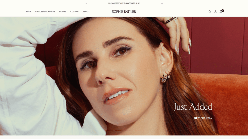
Imagine arriving at a store you’ve never encountered before. The homepage has an attractive photograph and says: Welcome to Our Store. Then what?
Customers shouldn’t have to investigate your website to understand why your products deserve their attention. your homepage should quickly communicate:
- What do you sell?
- Who is it for?
- Why should someone care?
- What makes your offer different?
- Where should they go next?
Compare: Welcome to our online store.
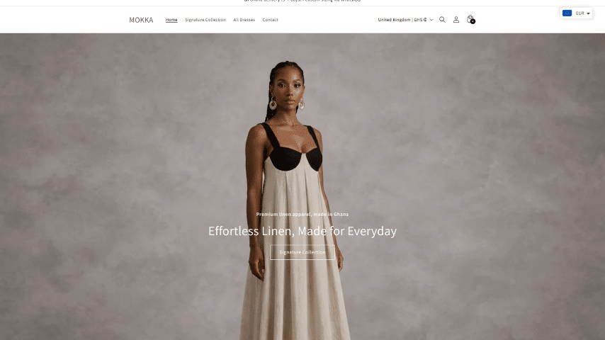
with: Handmade contemporary clothing designed for effortless everyday elegance.
The second immediately provides more context. your hero section doesn’t need an essay It needs clarity.
3. Your Product Pages Aren't Convincing Enough
The product page is one of the most commercially important pages in an ecommerce store.
A visitor has moved beyond browsing and is now examining a specific item. and this is where uncertainty needs to decrease.
A strong product page may need:
- clear product title
- high-quality images
- useful product description
- price
- variants
- size information
- shipping information
- returns information
- availability
- customer reviews
- payment information
- prominent Add to Cart button
- relevant product recommendations
One mistake is assuming that customers already understand the product because you understand it. They don’t. for clothing, for example, buyers may want to know:
- How does it fit?
- What material is used?
- Is it true to size?
- How should it be washed?
- What size is the model wearing?
- When will it arrive?
- Can it be returned?
Every unanswered question can become another reason to postpone purchasing.
4. Your Product Photography Is Hurting Perceived Value
Online shoppers can’t physically touch your products. photography has to compensate for that limitation.
Poor lighting, inconsistent backgrounds, blurry photographs and insufficient angles can make even an excellent product appear less valuable.
Strong ecommerce photography can show:
- front
- back
- side
- close-up
- texture
- scale
- product in use
- lifestyle context
For fashion, showing how an item looks on a person can provide information that a standalone product photograph cannot.
For physical products, detailed close ups can communicate materials and craftsmanship. Professional product photography isn’t merely decoration. It helps reduce uncertainty and reducing uncertainty can make purchasing easier.
5. Visitors Don't Trust Your Store Yet
You’re asking someone who may never have heard of your business to enter payment information and send you money.
Trust therefore matters enormously. ask yourself what evidence your store provides that says:
This is a legitimate business, and purchasing here is safe.
Useful trust signals can include:
Customer reviews
Real customer experiences provide social proof.
User-generated content
Seeing actual customers using your products can be particularly effective.
Clear contact information
Customers should know how to reach you if something goes wrong.
About page
Show that a genuine business exists behind the storefront.
Shipping information
Don’t make customers search for basic delivery information.
Returns/refund policy
Explain what happens if the product isn’t suitable.
Secure checkout
Your checkout should feel professional and familiar.
Trust isn’t created by adding ten random security badges beside the Add to Cart button.
It’s created through consistency and transparency across the entire shopping experience.
6. Your Shipping Costs Appear Too Late
A customer finds a product. they like it, they select their size, they add it to their cart., they enter their information. then suddenly: Shipping: $35 They leave.
This is a classic example of checkout friction. Unexpected costs near the end of checkout can make customers reconsider a purchase they were previously prepared to complete, where possible, provide shipping expectations before the final checkout stage. That might mean showing: Free shipping over $X, Flat-rate delivery, Estimated shipping cost or clearly explaining how shipping is calculated.
The objective is not necessarily to make shipping free. It’s to avoid unnecessary surprises.
7. Your Checkout Has Too Much Friction
Every unnecessary obstacle between I want this and Order confirmed creates another opportunity for abandonment.
Review your checkout journey yourself.
Do it on a phone. Start from the homepage and actually attempt to purchase a product.
Ask yourself:
- Is Add to Cart easy to find?
- Does the cart work correctly?
- Are variants clearly selected?
- Are there unnecessary popups?
- Is account creation forced?
- Are payment options suitable?
- Are errors clearly explained?
- Are shipping options understandable?
- Does checkout feel trustworthy?
- Is anything confusing on mobile?
Small technical problems can have large commercial consequences. A beautiful homepage doesn’t compensate for a broken purchasing journey.
8. Your Mobile Store Needs Work
A significant portion of ecommerce browsing happens on smartphones. yet many Shopify stores are still designed primarily on desktop and merely checked on mobile afterward. that’s backwards. look at your store on an actual smartphone.
Pay attention to:
Navigation
Can customers reach products quickly?
Product imagery
Does it display properly without awkward cropping?
Typography
Can everything be read comfortably?
Variant selectors
Are sizes/colors easy to tap?
Add to Cart
Is the primary action obvious?
Popups
Are promotional popups covering half the screen?
Sticky elements
Are multiple sticky bars fighting for limited mobile space?
Checkout
Can a customer complete payment without frustration?
Mobile optimization isn’t just making everything smaller. It’s designing around a different screen and different interaction method.
9. Your Store Is Too Slow
Imagine seeing an Instagram ad for an interesting product. you tap it. the page loads and loads. and loads. Your interest starts disappearing before the product appears. Store performance can be affected by:
- oversized images
- excessive Shopify apps
- third-party scripts
- tracking tools
- videos
- complicated animations
- poorly optimized theme code
- unnecessary app leftovers
This doesn’t mean you should remove every animation and app. It means every additional feature should justify the performance cost it introduces.
Start by checking your most commercially important pages:
- Homepage
- Collection pages
- Product pages
- Cart
A visitor shouldn’t need patience to shop.
10. You Aren't Recovering Visitors Who Almost Purchased
Not every customer buys during their first visit.
Some customers: view products then leave.
Others: add to cart then leave.
Others: start checkout then disappear. Those visitors aren’t necessarily lost forever.
A strong ecommerce strategy should include mechanisms for bringing qualified visitors back.
That can include:
Abandoned checkout recovery
Remind customers who began checkout but didn’t finish.
Email marketing
Build a customer relationship beyond a single website session.
Retargeting
Show relevant advertising to visitors who interacted with products.
Browse abandonment
Follow up when appropriate with visitors who viewed products but didn’t purchase.
Customer retention
Don’t focus exclusively on finding new customers. Existing customers may be considerably easier to sell to again when they had a positive first experience. Traffic acquisition and conversion shouldn’t operate separately. The entire customer journey matters.
The GreatCorp Recommendation
Don’t Immediately Redesign Everything
Low sales don’t automatically mean your theme is bad. That’s an important distinction.
If visitors aren’t buying because shipping costs are unexpectedly high, redesigning the homepage won’t solve the problem.
If your advertising is attracting the wrong audience, changing your product-card border radius won’t solve the problem.
If checkout is broken, adding another testimonial section won’t solve the problem.
Good optimization starts with identifying the actual bottleneck. then you improve that part of the journey.
Small Improvements Can Compound, Consider several modest improvements:
- Better product photography.
- Clearer descriptions.
- More visible reviews.
- Improved mobile layout.
- Faster pages.
- Clear shipping information.
- Simpler checkout.
- Better targeting.
Individually, each may seem relatively small. together, they can create a significantly stronger shopping experience. Conversion optimization is often less about discovering one magical trick and more about removing multiple small reasons not to buy.
Final Verdict: Before Spending More on Ads, Check Your Store
Paid advertising can amplify whatever already exists. If your store converts well, additional qualified traffic can create more opportunities for sales.
If your store has serious conversion problems, advertising may simply send more people into a journey that isn’t working properly.
Before significantly increasing advertising spend, examine:
- traffic quality
- product pages
- mobile usability
- photography
- trust
- cart
- checkout
- shipping
- performance
- analytics
Fixing conversion problems can sometimes produce more value than simply purchasing additional traffic.
Our work
Selected work. Built for real business and clients
Learn more